


#2: UI/UX Design for Gastronome (Sprint 1)
- Wan Ning

- Nov 4, 2018
- 3 min read
I began developing several prototypes in the first sprint.
Research had to be done to look into current competitor applications, to see how I could possibly improve on their interface as well as their interaction experience.
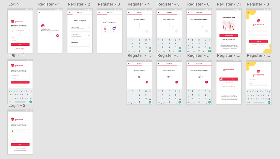
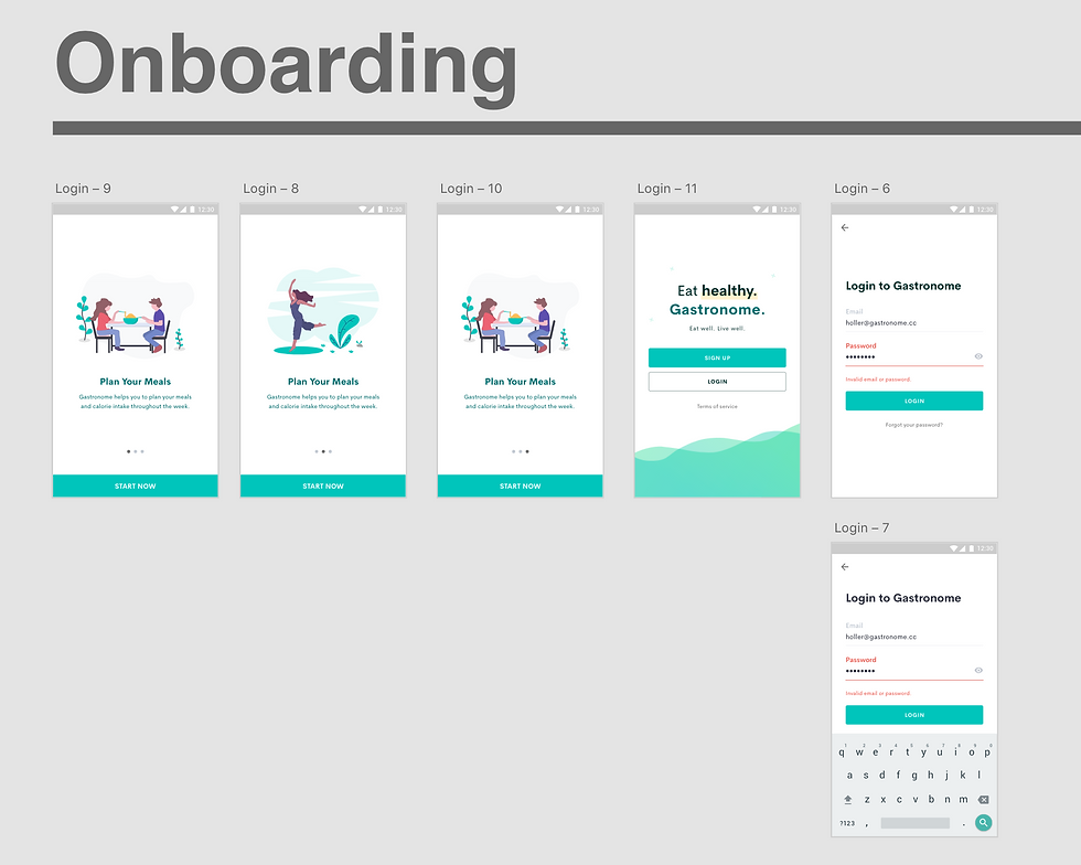
Login and Registration
I began designing the login and registration page. Since these pages set the first impression of the application, I had to get a grasp of the colour palettes that I will be making use throughout the designs.
I started off with storyboarding the entire process and decided that the first few pages that the user will view when they download the application will be the onboarding pages. I found some open-source illustrations (mainly https://undraw.co/) to illustrate and depict the features that users can look forward to in Gastronome.
The login page was simple. Users are given the option of signing in either with their Google account, or with their email.

The register feature was a little challenging— I had to figure out how I was going to structure the required questions without making it too overwhelming for the users to answer. There were at least 5 questions our team decided that we were going to include in order to start recommending recipes or predict weight changes for the user.
These questions included: their goal (lose weight, be healthier, gain weight), gender, age, height and weight. Decided to place each of these questions on single screens so that attention is focused on these questions, making these easier and less tiring to answer. Also decided to include a progress tracker on the top— figured it will make the process easy and intuitive as it creates a clear path to completion.
The page following the questions prompts the user to select whether they want to sign up using their Google account, or to continue with their email.
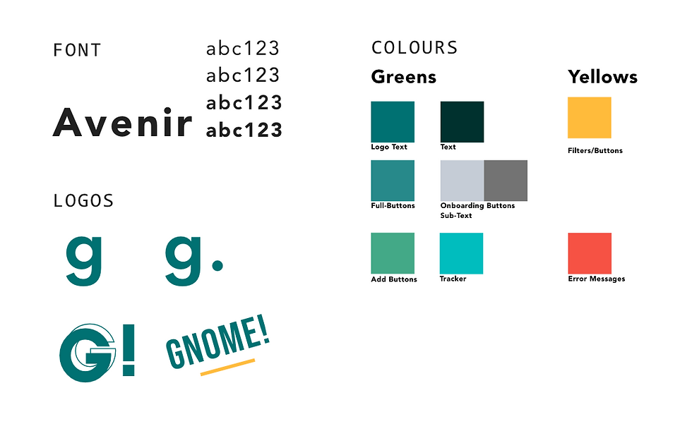
The original prototypes I created were based on the colour #EB304D, a reddish-pink tone (see image below). This colour was pretty much random with the group's consensus. Also used the font 'Aperçu Pro' for most of the text.

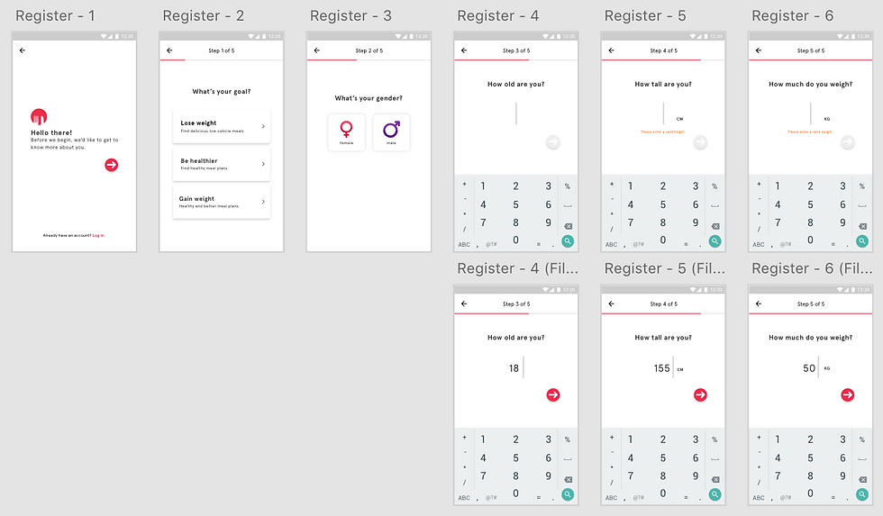
Update (5 Nov):
Removed the Google account feature and decided to solely focus on email creation. Changed the UI to better suit this requirement. Added an illustration so that the user's mental workload is reduced after finishing 5 questions (may be long to them).

With that, the first prototype turned out like this:
Main Features
At this point in time, I have yet to create the interface for most of the features. I started off with creating some screens for the ‘Today’ feature— which is the Menu feature of the application— where users are able to view the list of recipes that they have added to their list.
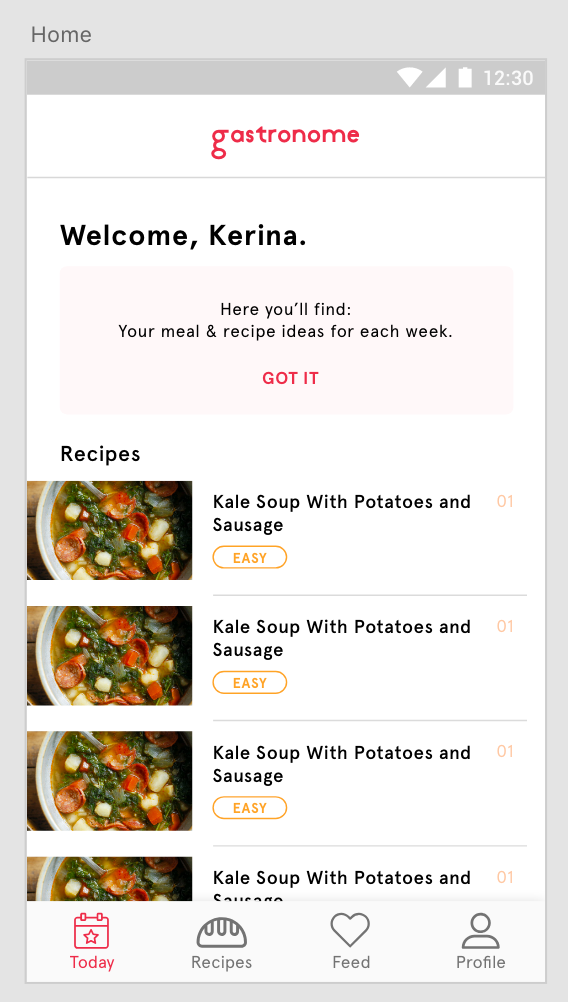
Decided to make use of tab menus here to showcase the different features, it being a recipe app.
'Today' shows all the recipes that the user has added to their daily log. 'Recipes' shows all the recipes that are available on the app. 'Feed' shows all the recipes that the user's friends have posted, and/or all the recommended recipes to the user. 'Profile' shows the user profile, including all the statistics and calorie/weight related graphs and calculations.
The first prototype is not very complete due to time-constraints. There are also a lot of UX-related problems, but this problems will hopefully be solved by Hackathon week so I could quickly get more feedback on how I could improve on these designs.
Not very satisfied with how this turns out, so there'll probably be major changes to the colours, fonts and all things UI related in the next sprint. It'll be Hackathon week soon, so I hope to finish by then.
Personal Notes
Most important thing to note this week is that getting user feedback is pretty important to improve my designs. Essential to keep an open mind about changes and be flexible to create better designs. Also learnt the need to communicate well with the developers (the gods Kevin and Dom) so that they know what they have to do to recreate the designs.
Also, the challenges that I faced this week. Designing for Android is pretty much new to me since I have never owned an Android phone. It was difficult for me to visualise or learn how the typical Android applications look like, and a lot of research had to be done while I visualise the application's design. I also had to figure out the limitations that developing Android apps have.
Pretty good sprint!!!
Wan Ning
Comments