


#4: UI/UX Design for Gastronome (Sprint 3/4)
- Wan Ning

- Nov 25, 2018
- 3 min read
Post-Hackathon.
The initial designs did for the Hackathon did not really appeal to me.
I went ahead to redesign some parts of the interface to make things look more appealing and the navigations more intuitive.
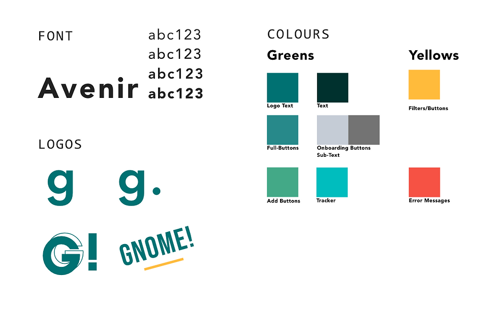
The colours used for the Hackathon were all over the place— I made use of green and blue interchangeably then, so I wanted to standardise the look and feel of the app in this new design.
Assets
I changed up the overall colours and font of the prototype. Also made a few text logos to put in the website, slides, and all marketing-related print.
Final Prototypes
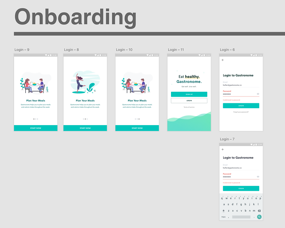
Changed the colours for the Onboarding page. Also included the onboarding pages that users first view when they open the app.
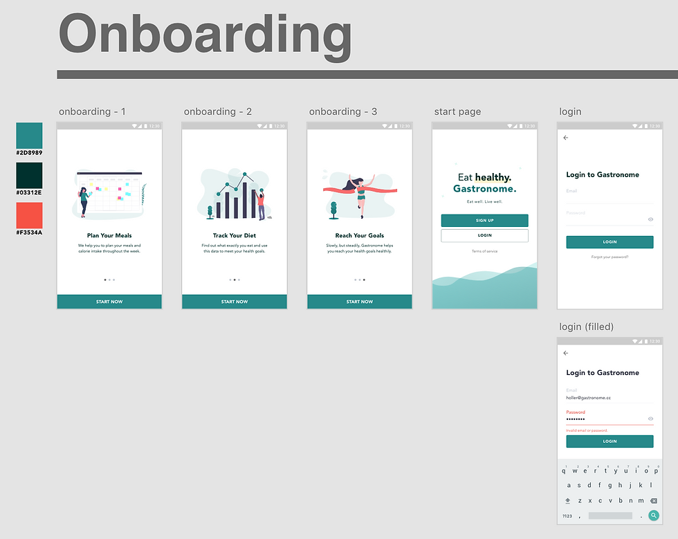
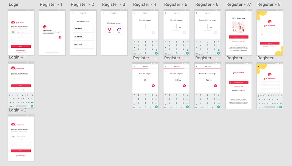
Changed and cleaned up the interface for the register pages.

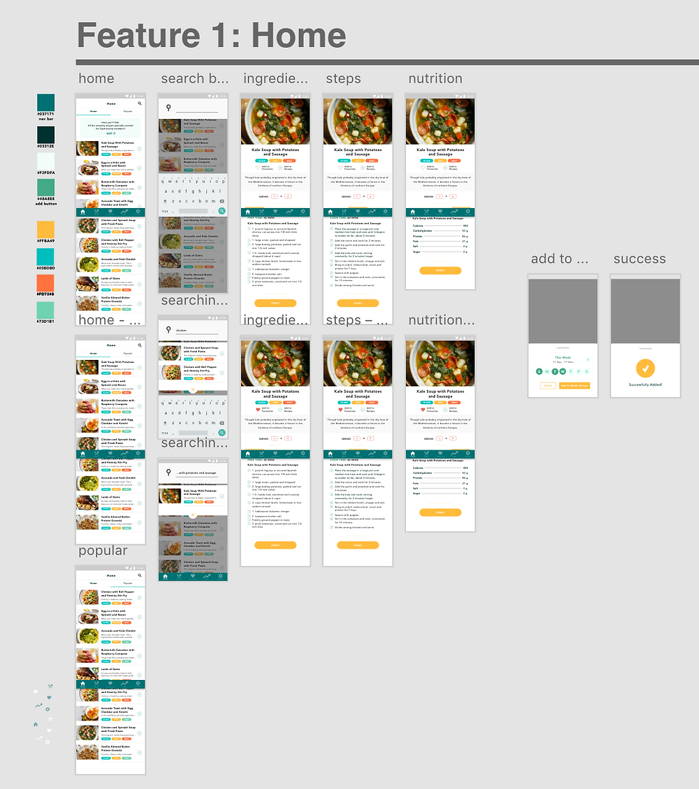
The main user interface for the application features a new tab bar. This tab bar consists of Home (renamed from "Feed"), Menu (renamed from "Today"), Favourites, Track (renamed from "Progress") and Settings.

The image below depicts the Home feature. I changed and cleaned up a lot of the font (size, weight, etc.) to make it look a little bit more polished. I also replaced all the placeholders I had from the previous prototypes to make it reflect what the application will look like in the end.
After several bouts of testing with my friends (thank you for helping), I changed up little things— such as making the buttons more intuitive (have yet to design the interface for the step-by-step instructional feature. will require more time for designing that portion).
Similarly to the Home feature, I changed up a few parts of the Menu feature— such as removing the icons, as well as giving a new look to the "Next 7 Days" title to make the interface a lot cleaner than it previously was.
The "Log other foods" feature was also included. The icons used are more intuitive in this release, and a pop-up UI is also created for users to log their food/water intake.

The Favourites tab is newly introduced in this sprint. All recipes that are favourited by the user will be shown in this part of the tab.

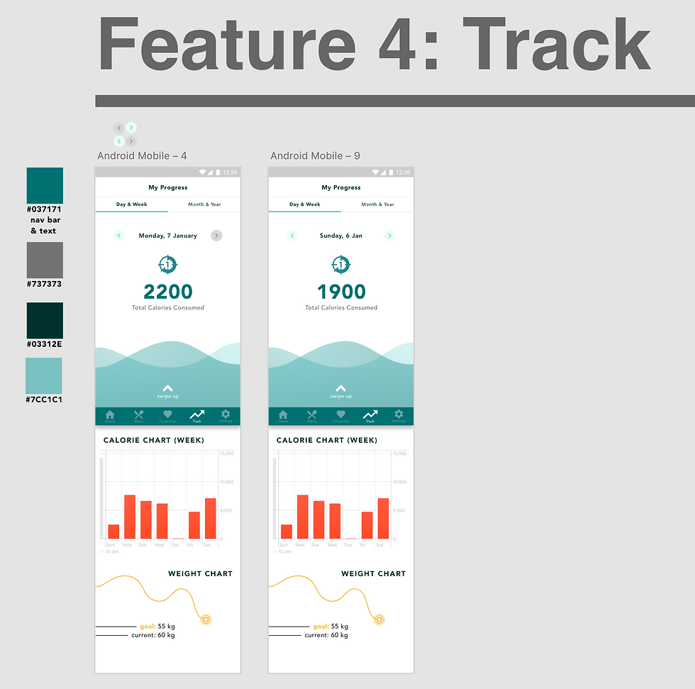
The track feature will first feature the total calorie count for that day or week. Users will have the option of viewing the calorie graphs and weight graphs by day, week, month or year. Due to the lack of time, I wasn't able to refine the user interface as well as test the user experience proper.
We decided to just focus on showing the calorie-intake of every single day, and then display this information in a calorie graph. The weight graph also features the weight changes that the user will go through, and the predicted change following the amount of calorie-intake.
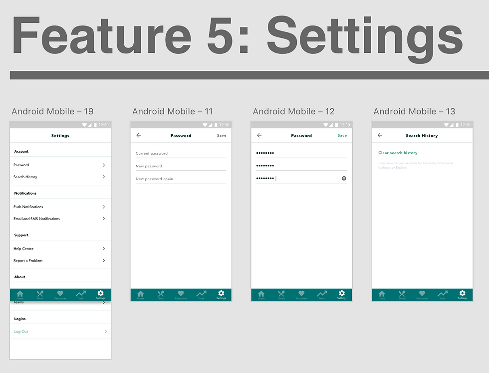
The Settings feature of the application will focus mainly on the Password change feature for now. The following screens are how it will look like. Search histories can also be cleared in this release.
Personal Thoughts
It was honestly pretty exhausting to go through several sprints and not have more design ideas on how I could design the application. I then settled on focusing on several features and creating the user interface of these features, while simultaneously getting feedback from testers. This saved a lot of time, rather than my usual redesigning-and-then-testing style.
Learnt a lot about time management in this sprint. Without providing the proper user interface and designs to the developers can delay a lot of the process, since they will have to code out the user interface that I did up. 😭
Real grateful to have this team, to constantly deal with the change in all the designs I make. 🎉☺️
Wan Ning
Comments