


#3: UI/UX Design for Gastronome (Sprint 2)
- Wan Ning

- Nov 11, 2018
- 4 min read
Hackathon week. Rapid prototyping.
I made a few changes to the user interface this week. Mainly changed the colour and design and feel of the entire page.
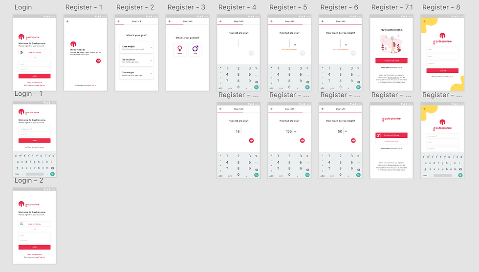
Onboarding, Register and Login
Here are a few screen captures of the onboarding, registration, and login pages.
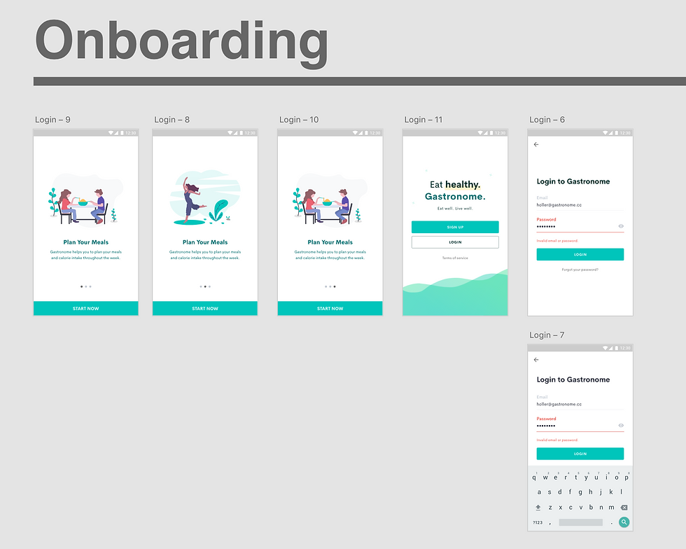
The onboarding pages will follow a similar style, as shown above. Illustrations and text are all placeholders for now. I changed the overall colour scheme to green (#EB304D), making the application have a 'healthier' feeling in general.
I also cleaned up the design of the start-select page since my team decided to scrape the Google login feature.
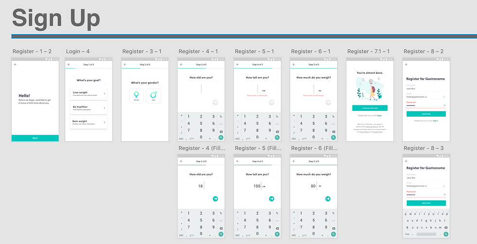
Similarly, the sign-up pages also followed a similar colour scheme (#EB304D). The register page was also cleaned up and I made similar changes to the login page. You can view the assets I used in this version below.
Main Feature
I started rushing the 'Today', 'Feed' and 'Progress' feature in this sprint. To recap, the Today feature consists of meals/recipes that are the user will add to log the food they ate, the Feed feature will show all the recipes available in the app and the Progress feature (newly added) will show the calorie, weight graph, and all related information the user needs for analytics purposes.
Our minimum viable product for this sprint is the Progress feature— this feature features a calorie graph, weight graph, as well as shows the goals and progress of the user in reaching their goal. Their BMI will also be logged.
Before I started doing a prototype on Adobe XD, I decided to draw a simple paper prototype to show the navigational structure of the application. This process took some brainstorming and communication with the rest of the team. Here's how it looked like at the start:
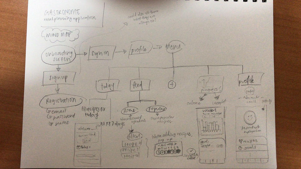
I changed up the navigation bar to include more features that we wanted to add in after the Hackathon. The tab bar now consists of the 'Today' feature, 'Feed' feature, 'Progress' feature as well as 'Profile' feature. I made use of icons to represent these features, but I felt like this could be better improved since these icons did not exactly convey the features of the app to my testers.

Today
The "Today" feature consisted of recipes that the user has added to their meal plans. It will consist of meal plans for Today, as well as the next 7 days. At the bottom, the user will also have the option to log their own meals (e.g. meal name, calories, etc.), as well as a calendar for them to track whether they have anything planned for the month.
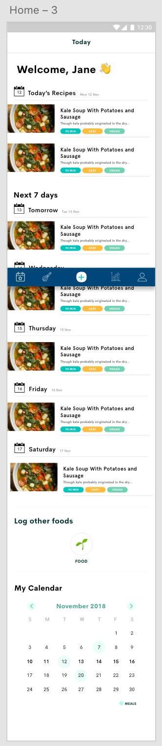
The same images and text are used as a repeat grid; placeholders to save time.
Feed
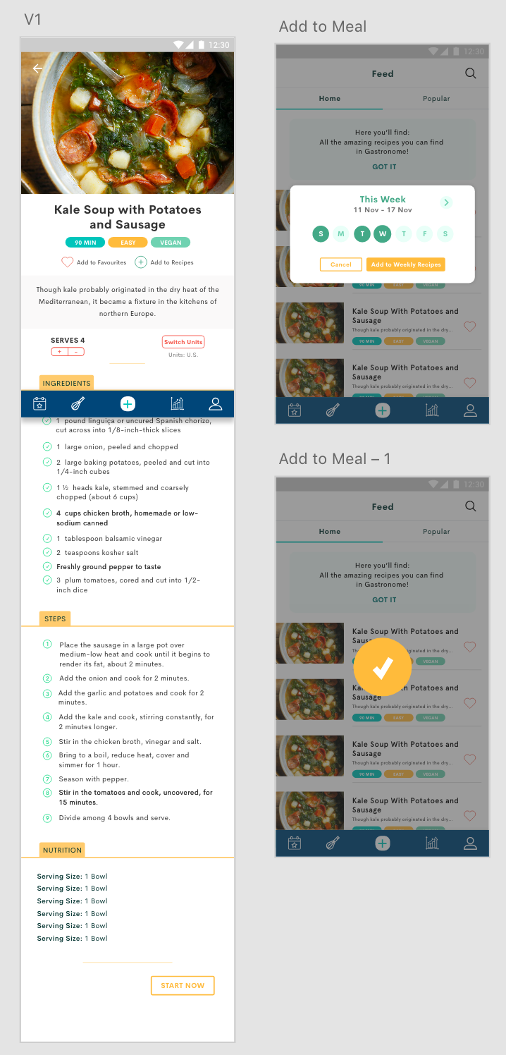
The feed page will have a Home and Popular tab, supplemented with a search bar for easy searching of recipes. There will be a small, removable note at the start to inform users what the page is used for. Under each recipe, there will be the recipe name, short description as well as some tags (future use, recipe filtering). An add button will be at the side for users to add the recipe (could be changed to swipe).

Upon clicking the search bar, users will be able to search their desired recipes based on their names. Search by filter will be designed at a later stage.

When a recipe is clicked, users will be greeted by the individual recipes page. This page will include the image, title, tags, add to favourites and add to recipe buttons, add/subtract serving size as well as unit conversions. The ingredients, steps and nutritions of the meal will also be shown below.
When a user adds a recipe to their meal plan, they will be prompted the week and day they would like to add it to.
I went around asking for feedback about the user experience, and found out several ways I could improve my interface. The images shown below depict these changes.

I changed up the add/subtract servings button positions, since I got feedback that the most intuitive positions would be to place the add and subtract buttons side-by-side. I also made some tabs to show the instructions, steps and nutritions.
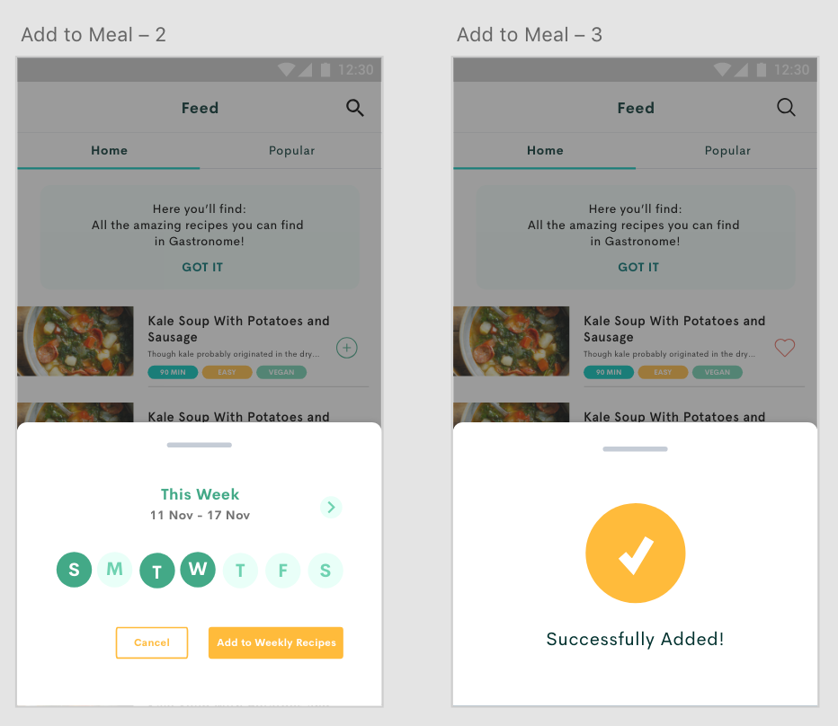
As for the adding of meals, i included the pop-ups at the bottom of the screen since it is easier for the user to click from the bottom of their screens, instead of it being in the middle. This design also makes the interface cleaner.
Progress
Though the MVP of this project, I found it hard to design the progress page because of the lack of experience I have with creating intuitive graphs. I had to also understand the limitations, communicate with Kevin about the graph libraries, and try to find a design that could best suit what should be seen in the final prototype.

The current progress page includes a graph showing the user's weight, as well as texts showing the user's goals and weight estimation with the current average calories consumed each day.
Assets
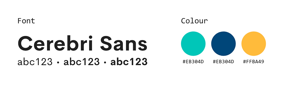
Changed the font to Cerebri Sans to make the whole interface look more polished. Also made use of darker and eye-pleasing colours for the main feature to increase conversion rates.
Personal Notes
Could possibly standardise the colours better and make the greens darker. Will continue refining the interface after the Hackathon period since there's currently a lack of time. There is also a need to check the sitemap of the application. Could possibly make use of some analysis technique to check whether the current navigations are intuitive.
Was quite challenging to design the Progress page with little references. Also challenging to re-design so many pages and screens within a few days. Pretty exhausting.
Learnt that it is super important to communicate with the developers. Also about exporting images and such, it was difficult for me to know what format I should export in, and what kind of images Kevin and Dom required since don't have much experience with building apps!!! 😖
All in all, the Hackathon made it easier to gather feedbacks and increase productivity within the group. It was overall, a good experience.
Wan Ning
Comments